Industry
B2B SaaS
Client
Tyk Technologies
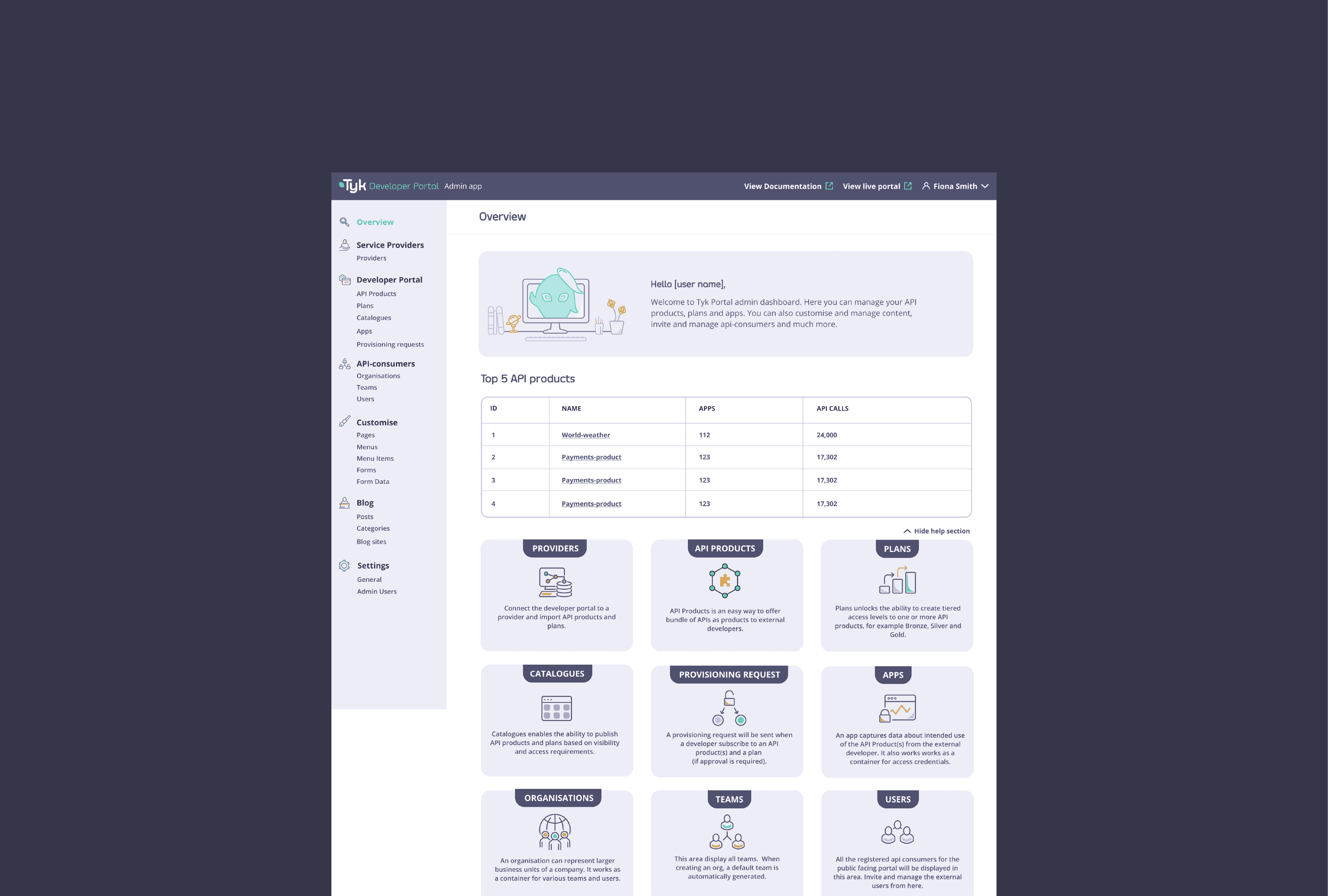
Tyk API Developer Portal
Designing an API platform for developers
Tyk is an API management platform used by companies to build, manage and monitor their APIs.
When I joined Tyk, I was part of the design and marketing team. As the company grew, the design team split and I moved over to the product team.
That was when I started working more closely on the actual product experience, including Tyk Portal.
My focus was simple: understand how developers use the product and make the experience easier to work with.
A product for developers
Tyk is a technical product, and its users are mostly developers.
That changed the way I approached the design. I could not just think about whether a screen looked good. I had to understand what someone was actually trying to do, what information they needed and where they might get stuck.
I spent time looking through existing flows and talking with the team about how customers were using Tyk. There was also a big difference between designing for someone who was just getting started and someone managing APIs across a larger organisation.
The challenge was making the product feel approachable without getting in the way of people who already knew what they were doing.
Starting with the foundation
Before getting deeper into Portal, there was some work to do across Tyk's existing design system.
The company was going through a rebrand, so I worked on updating the UI library to fit the new direction. I also looked at accessibility as part of this process. For example, I reviewed colour choices against WebAIM's accessibility guidelines and worked on some basic rules for keeping the UI consistent.
This gave the product team a better foundation to work from as we started building and improving the product.
Giving Tyk's website another look
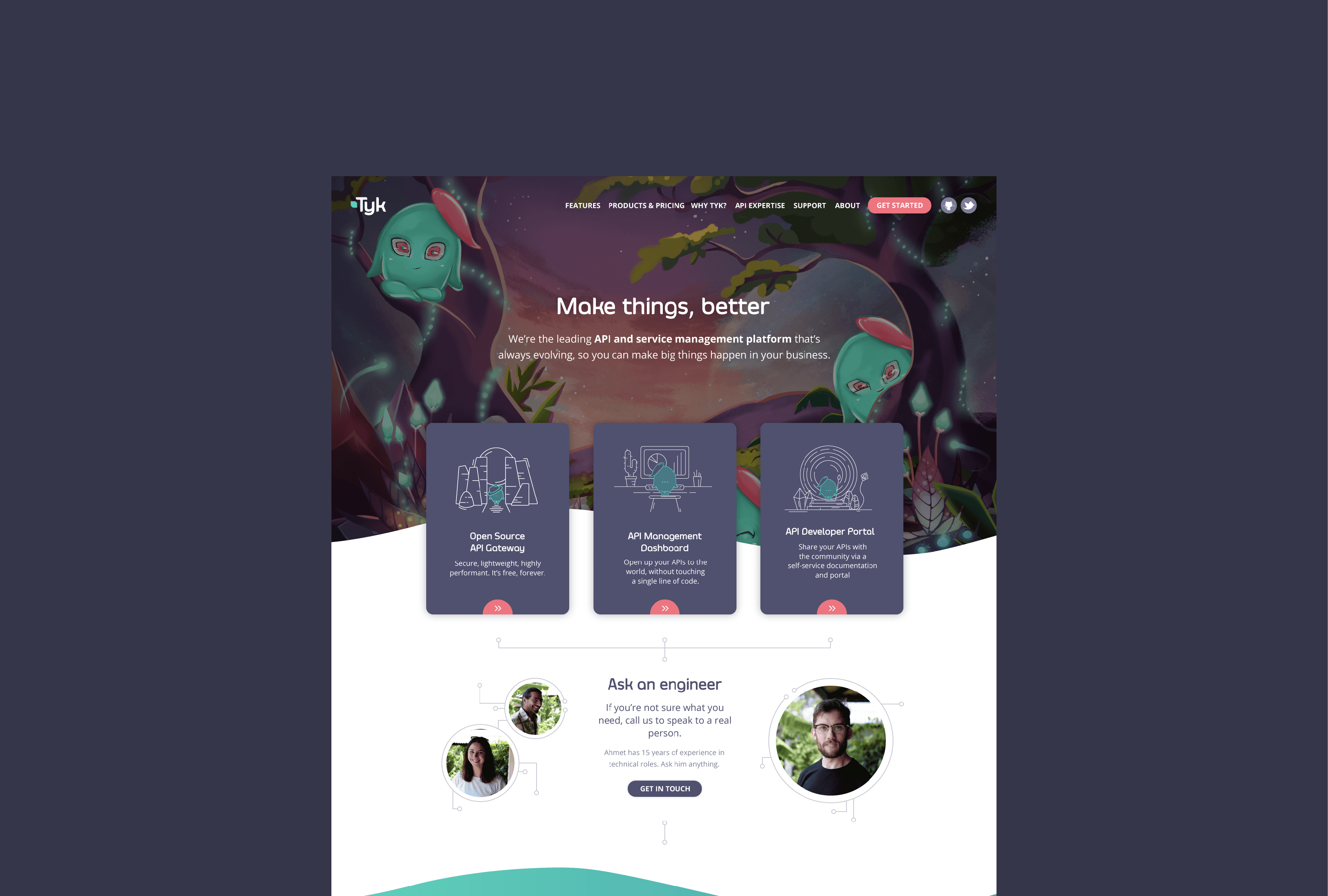
I also worked on the Tyk.io website.
We noticed that people were dropping off before getting halfway through the homepage, so I looked at Hotjar heatmaps to understand where people were spending time and where they were leaving.
We also spoke with clients to get a better sense of what information they were looking for. One thing that became clear was that we were trying to say too much at once. So instead of simply adding more content, I reorganised the page around the information that mattered most.
The aim was to help someone understand what Tyk does and whether it was relevant to them without having to dig through the whole page.
Designing Tyk Portal
This was where I spent most of my time as part of the product team.
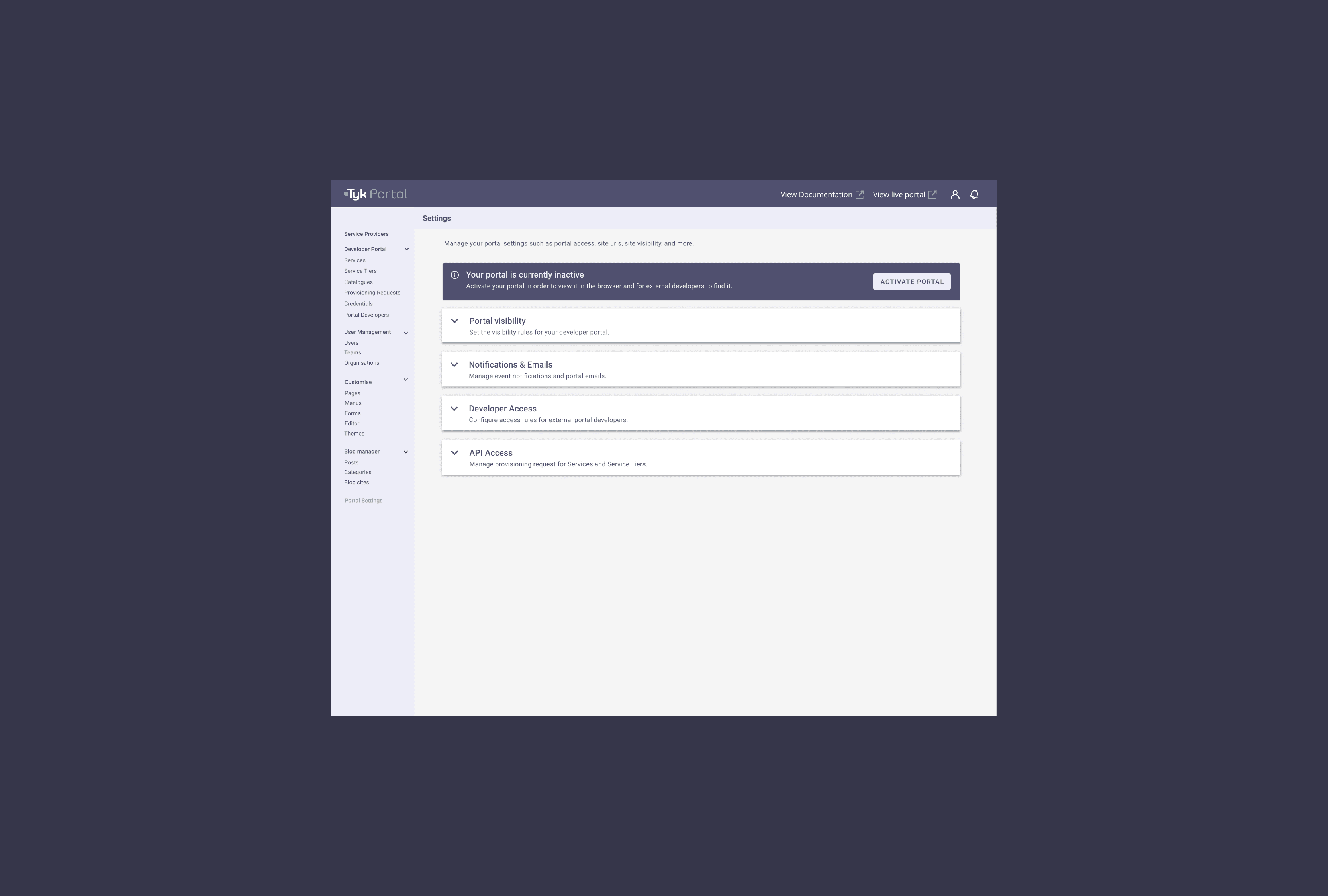
Tyk Portal was being built as a place for developers to discover and work with APIs. I worked on the experience from the perspective of someone actually using the product.
What do they need to see first?
What information is useful at this point?
What can be kept out of the way?
And how do we make the interface feel familiar when the product itself can be quite technical?
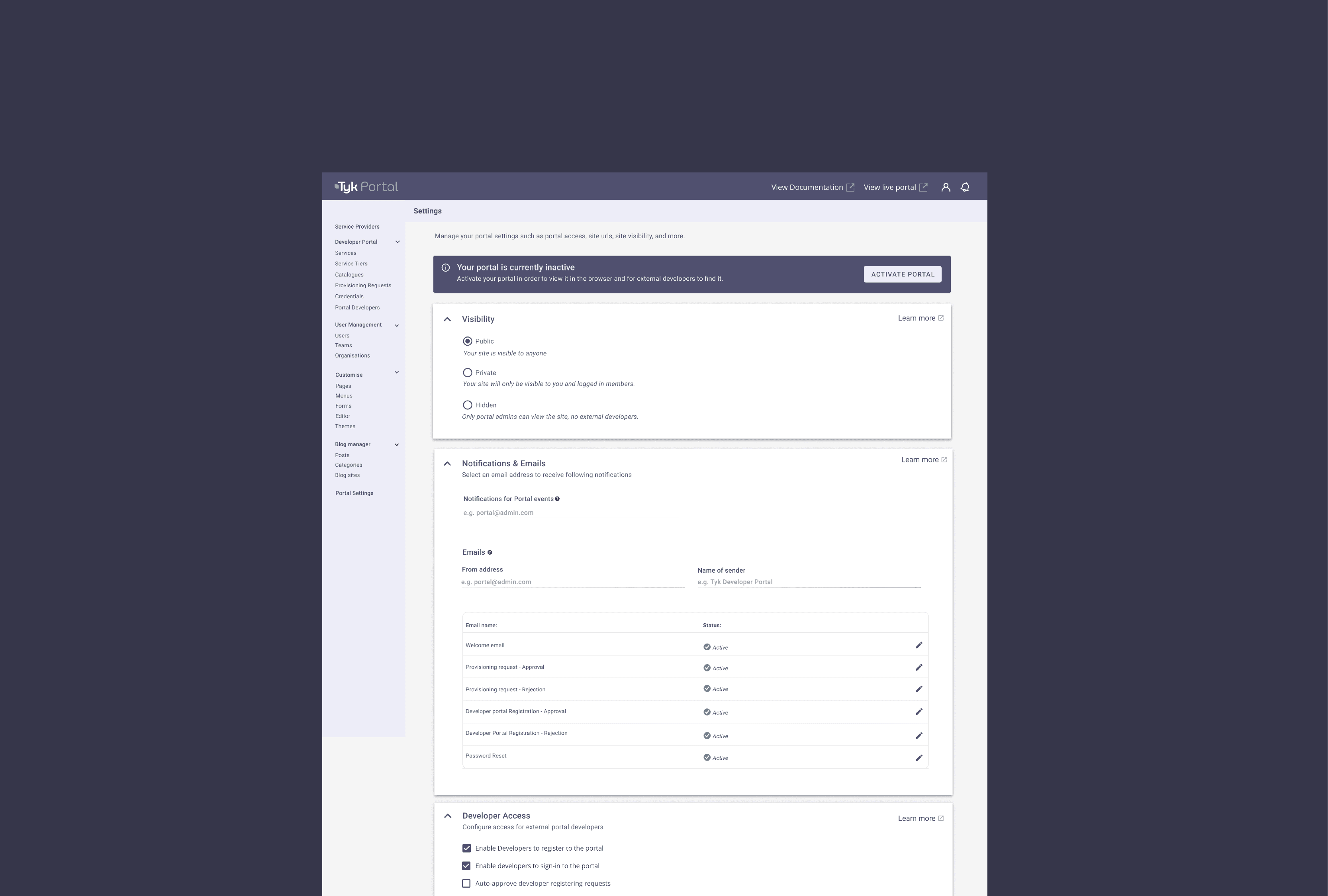
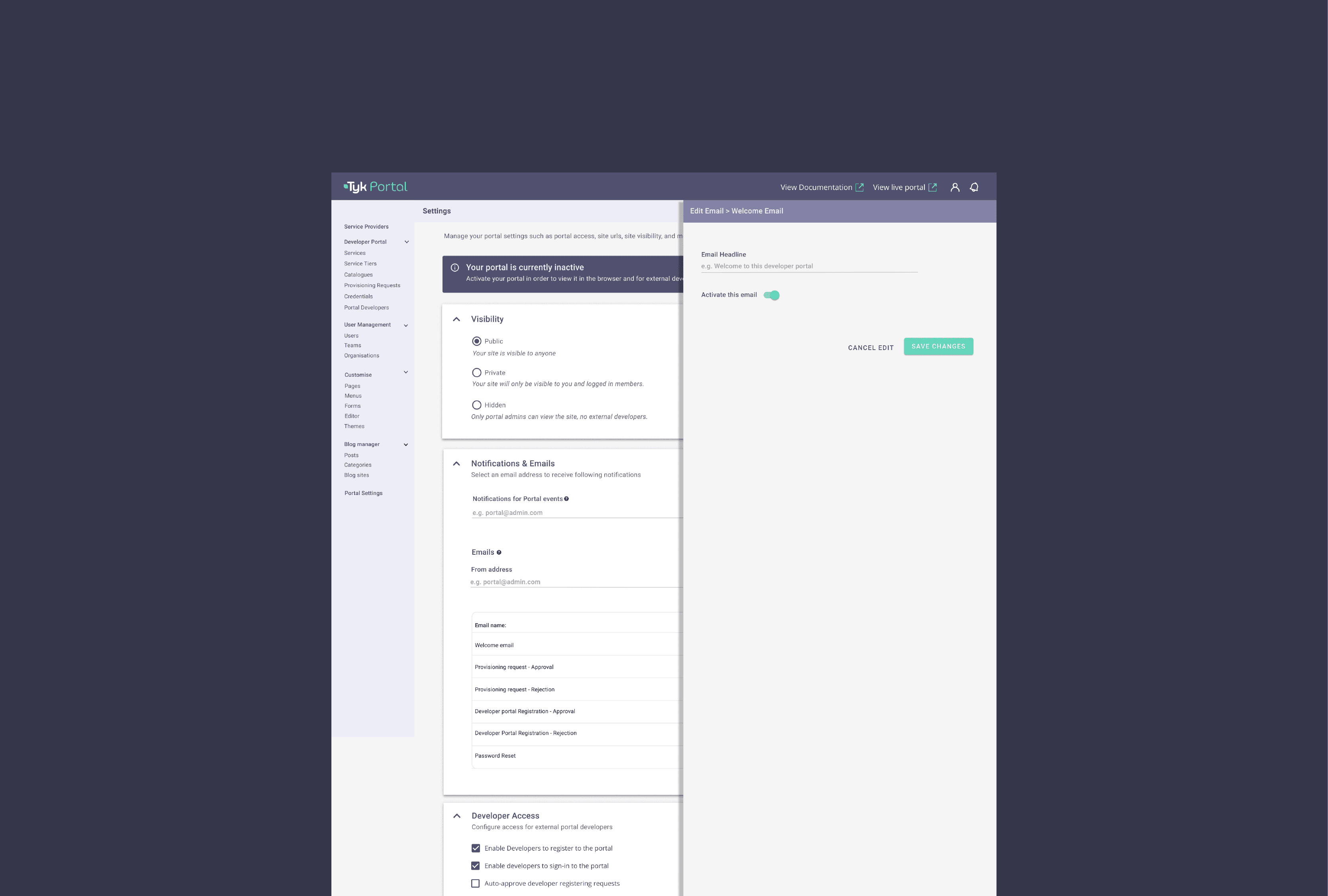
A lot of the work involved designing and refining screens with the product team, discussing requirements and working through different ways of handling the information.
There were plenty of small decisions along the way. Sometimes it was about the layout. Sometimes it was about how information was grouped or how a particular interaction worked.
Nothing particularly flashy, but those details add up when you are working on a product that people use regularly.
Working with the team
One thing I enjoyed about moving into the product team was being involved earlier in the process. I was not just receiving a brief and designing screens.
I worked with product managers, developers and the rest of the team to understand what we were trying to build and what made sense from a user perspective.
There were times when the first idea did not quite work, so we talked through it, changed things and tried again.
That back and forth was a big part of the job.
The result
The work contributed to the launch of Tyk Portal and helped establish a more consistent experience across Tyk's products.
The website was also restructured around the information users were looking for, rather than simply adding more content to the page.
For me, the bigger takeaway was getting to work on a product where the users had very different levels of technical knowledge.
It pushed me to think beyond the interface and pay more attention to what people were actually trying to accomplish.
What I took away
Working on Tyk was probably one of the projects that helped me understand product design better. Coming from a visual design background, I was used to thinking a lot about how things looked and felt.
Working with a technical product made me think more about the stuff behind the interface too.
How does this work?
Why does the user need this?
What information do they actually need here?
And sometimes, should we even be showing this?
I did not have all the answers, and I think that was part of the learning.