
Industry
Flower and Landscaping
Client
Prince's Landscape
Moving Prince's e-commerce experience forward
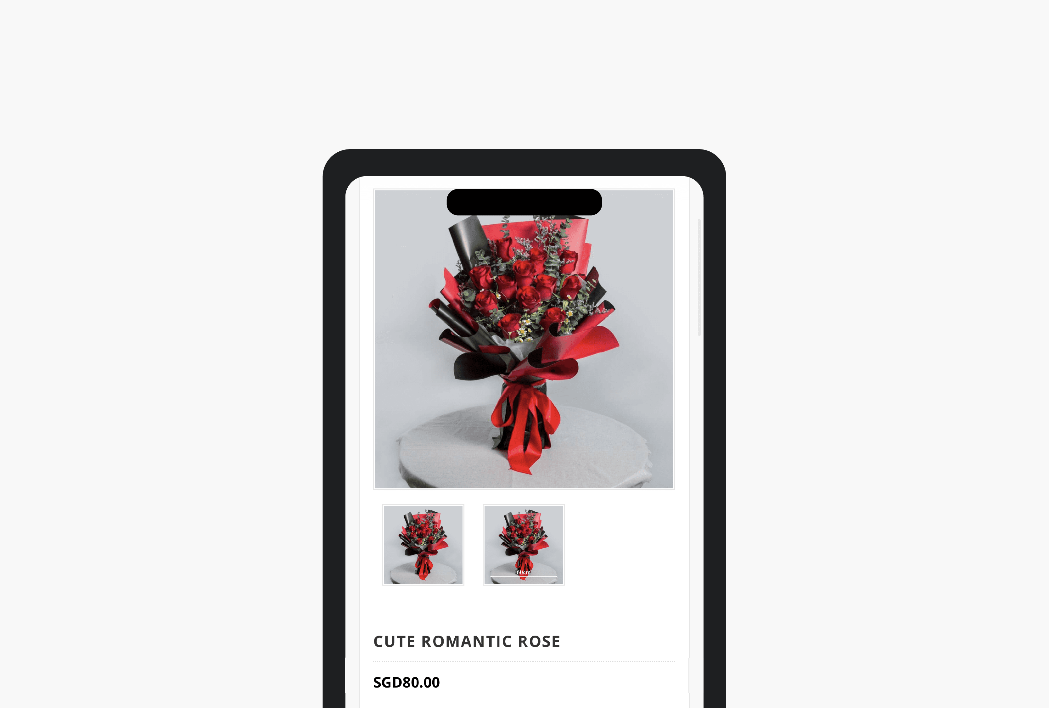
Moving Prince's e-commerce experience forward
Prince's is a family-owned Singapore business that has been around since 1966, with both a flower and landscaping business.
I was the designer for the Flower Department, where I worked on the e-commerce website together with the marketing team. This was around 2016, before terms like UX and product design were as commonly used as they are today. At the time, we mostly just called it website design.
But the problems were pretty familiar.
The website was old, it was not mobile-friendly and customers were having trouble completing their purchases. We also had a sales target to hit, so there was a very real business reason to improve it.
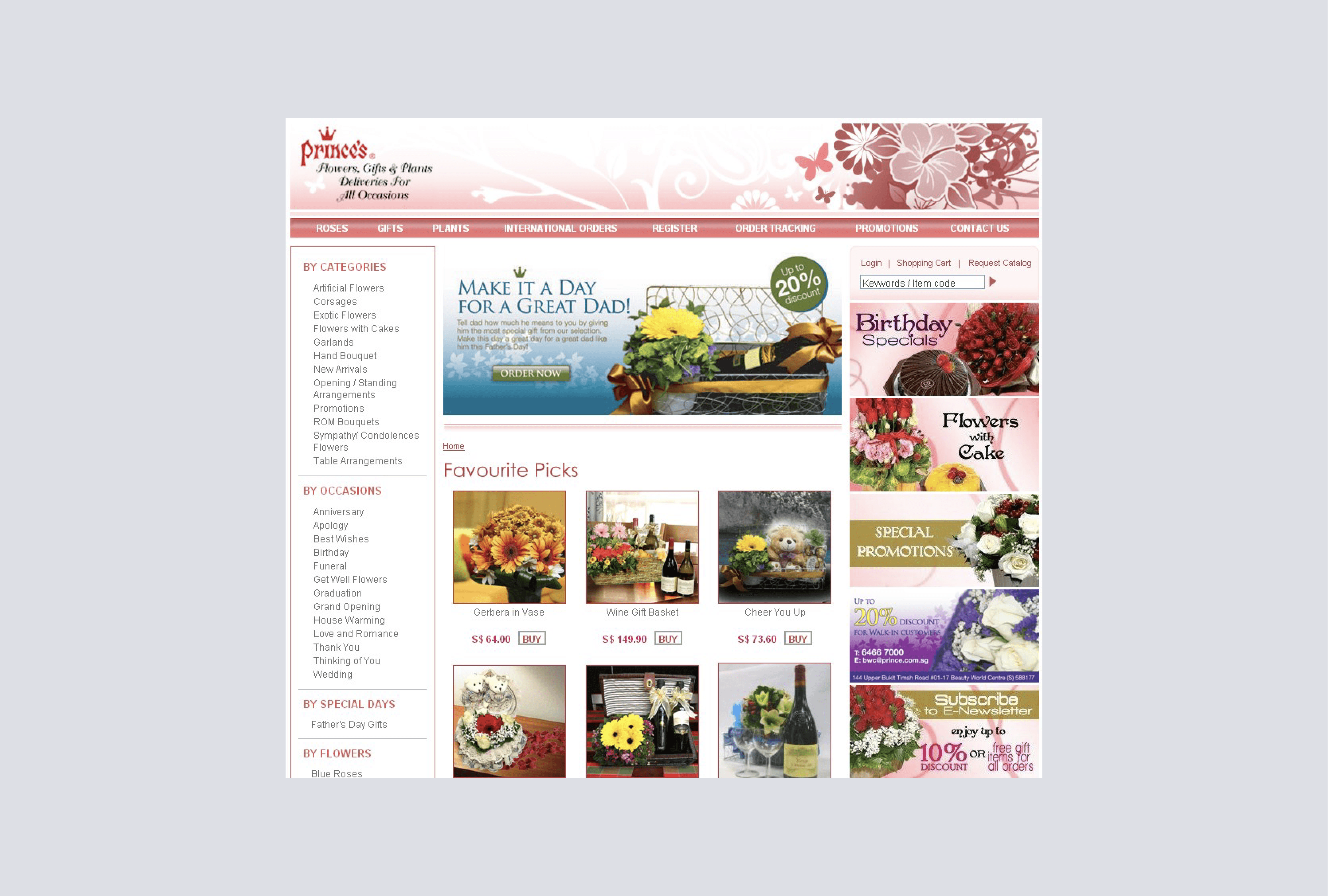
The problem
The existing website was difficult to use, especially on mobile. The payment experience was also causing problems. There were limitations on the backend, which meant that some customers who could not complete their payment online had to call us to make payment over the phone.
That was not a great experience for customers, and it also created more work for the team. At the same time, other florists were starting to offer much more modern online shopping experiences. We knew the website needed an overhaul.
Moving to a new platform
I was involved in the migration of the e-commerce website, which meant helping to organise and move a large amount of existing content and product information. I worked with a third-party developer on the site structure and sitemap.
There was quite a bit of content to work through, so we looked at how products and categories were organised and how customers would find what they were looking for. It sounds simple, but when you have a lot of products and information sitting on an old website, it gets messy pretty quickly.
The goal was to make the navigation easier to understand and make it easier for customers to get from browsing to buying.
Fixing the checkout experience
The payment flow was another area we needed to improve. Previously, customers could run into payment issues because of limitations with the existing setup.
As part of the new site, we introduced more straightforward online payment options, including Visa and Mastercard. This meant customers could complete their purchase online instead of having to call the team to sort out payment.
It was a fairly simple change, but it removed quite a frustrating part of the buying process.
Working on the content
I also worked with a freelance copywriter on the content for the new website. We went through the category and product pages and worked on making the information clearer and more useful.
There was also an SEO consideration, so we were not just thinking about how the copy looked on the page. We also had to think about what people might actually search for when looking for flowers online.
This was one of the projects where I started to understand that design is not just about the interface. The content, navigation, search and checkout all affect whether someone actually manages to complete a purchase.
Designing around a real sales target
The website work was closely tied to the business because we had actual sales targets to work towards.
Valentine's Day was one of the biggest opportunities for the flower business, so there was a lot of focus on making sure customers could find products and complete their orders without unnecessary friction.
The initial sales target for Valentine's Day 2017 was $50,000.
We ended up making almost three times that target.
Of course, the website was not the only reason for the sales result. There were marketing campaigns and other business activities happening at the same time. But it was encouraging to see the work we had put into the online experience supporting a very real business goal.
What I took away
This project was one of the first times I really saw the connection between design and business results.
At the time, I was not thinking about it in terms of a formal UX process. I was simply trying to make the website easier for customers to use and help the business sell more online.
Looking back, it taught me that even small improvements across the shopping experience can make a difference. The navigation, content, product pages and checkout all play a part in helping someone go from browsing to actually making a purchase.
It also gave me an early appreciation for designing with both the customer and the business in mind, which is something I still carry into my work today.